Dew Devlog
I Don’t Construct Heads With Loomis and Neither Should You
A drawing note about why the Loomis head method can feel unreliable, and why I prefer a simpler bell-like head construction.
I Don’t Construct Heads With Loomis and Neither Should You
The Loomis head is a classic and well-established head drawing method, but its flaws make it unreliable.
First off, let me state that I absolutely respect Andrew Loomis. He has been a staple draftsman and teacher since the 1940s. His methods have influenced comic artists, animators, character designers, and many aspiring artists today.
The man has written quite a few books, some of them I own and have read cover to cover. Like most artists, we are visual creatures. We don’t typically pay much attention to the fancy words and letters within these tomes. I’m guilty of doing this myself to my own detriment, considering the text is supplemental and quite important to the diagrams and information being presented. Which brings me to...
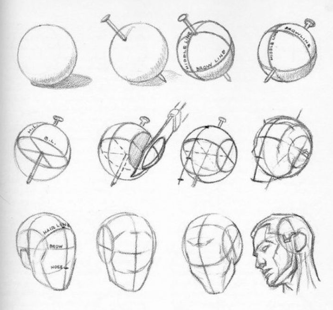
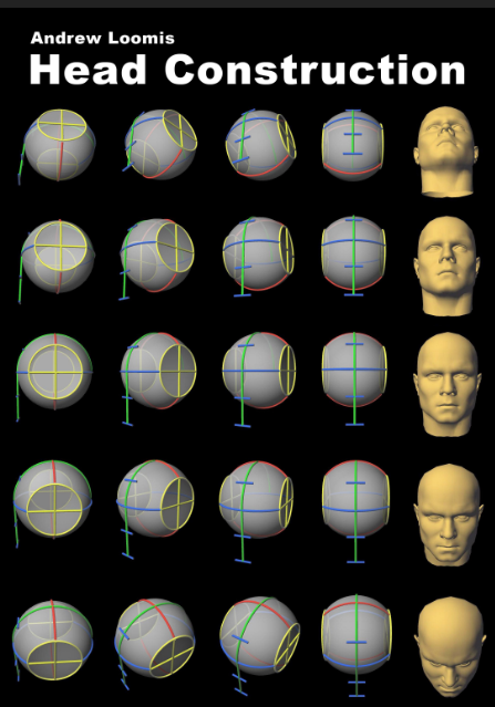
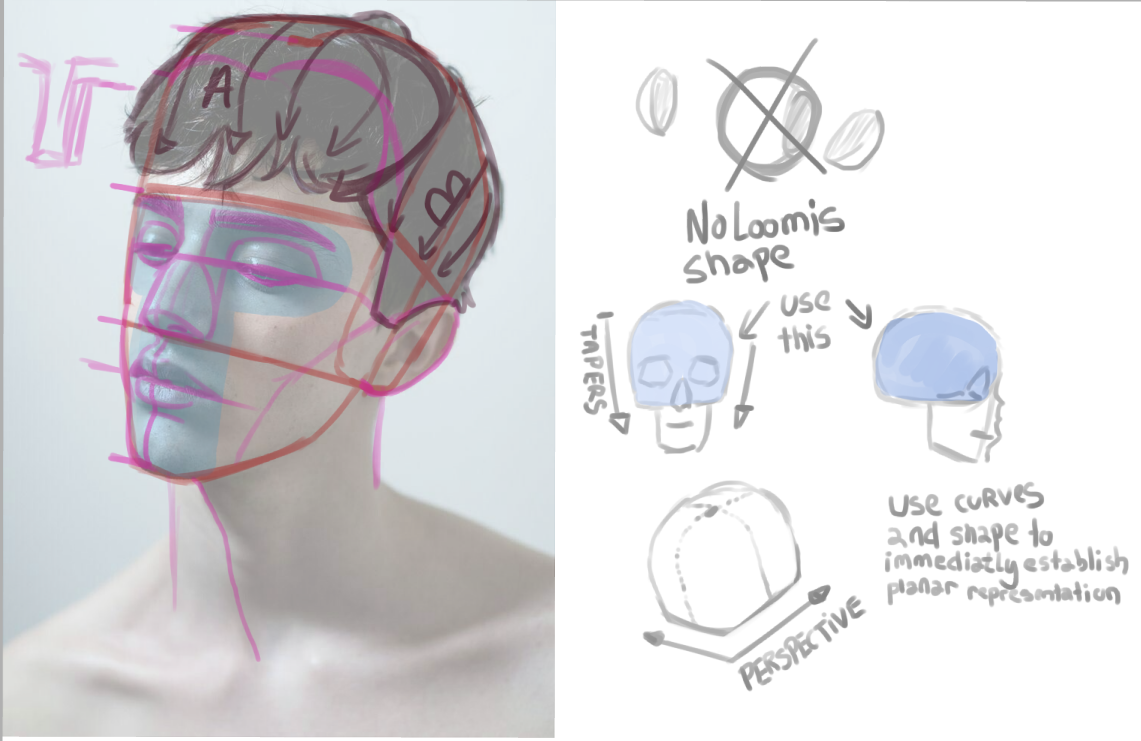
If you make visual art, this image has more than likely crossed your purview on more than one occasion. It’s quite ingenious for a step-by-step process, especially for a beginner. Even intermediate artists swear by this method to this day, and for good reason. You begin with a sphere, which is a simple primitive shape to draw, but spheres are not heads, so Loomis has us do the unthinkable. Slice the sides off of the sphere! Of course, there are some established coordinate curves. We duplicate a measurement down to extrude the shape and voila! A completed head!
Therein lies its inherent flaw. Heads are not spherical, at least human ones with realistic proportions. One could make the argument they’re more cube-like than round. However, no two heads are really the same shape. Which brings me to one of my main criticisms.
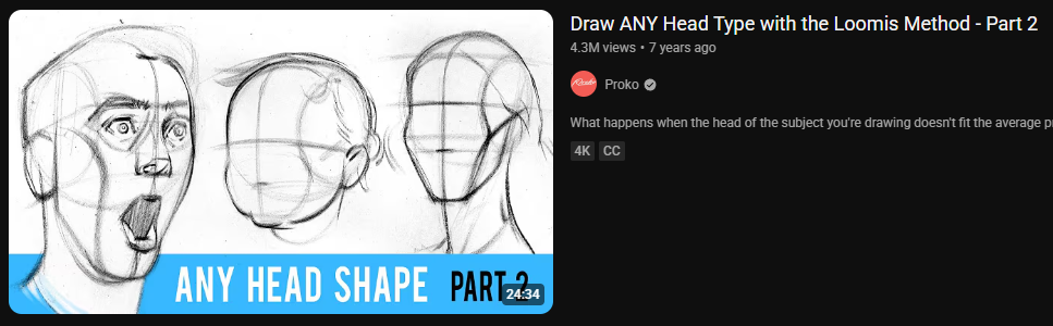
The method makes generic heads. This becomes apparent quickly, and other instructors have tried to address this by making supplemental info. Stan Prokopenko has done such a video here: Proko Loomis Head Video.
Still, I believe the method ends up with very lackluster heads, and to add further insult to injury, the method is tedious to do for a quick sketch. Consider how many steps are involved.
- Draw a circle/sphere
- Wrap coordinate lines around the ball
- Slice the sides off
- Measure ticks down to find the chin
- Complete the jaw line
Keep in mind, I left out any other obvious stuff like adding features since that’s not what I’m discussing here. These are the bare minimum steps needed to just establish the core of what the shape needs to be as a tool to benefit us as an artist.
If something brings out mediocre results or is convoluted, then I don’t believe it’s worthwhile. Here is what I believe should be the conditions for something to be useful to us as a tool for consistent drawing.
- It must show which way the head is tilted
- Look volumetric
- Have planes
- Proportions that are approximate or accurate enough
- Be fairly quick to lay in a few marks
- Give consistent results
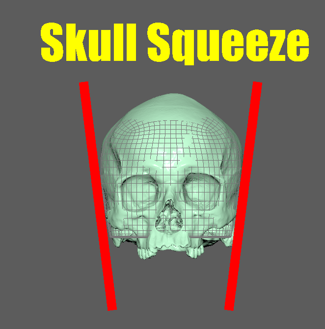
The Loomis method ticks a few of these for sure, but unfortunately, they’re not skull-like. Pulling from Google, we can see some more supplemental info others have done.
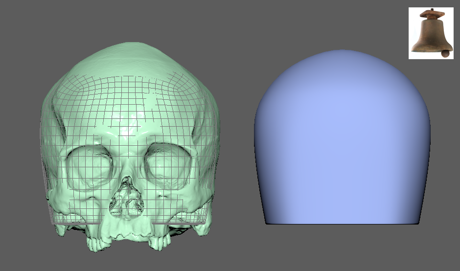
You can immediately see this is following Loomis’s method to a T, and we can see how flat the side of the head is. We also have this round cap on the bottom of the sphere, which will be drawn over/erased and serves us no purpose at all. Let’s take a look at a skull with no jaw.
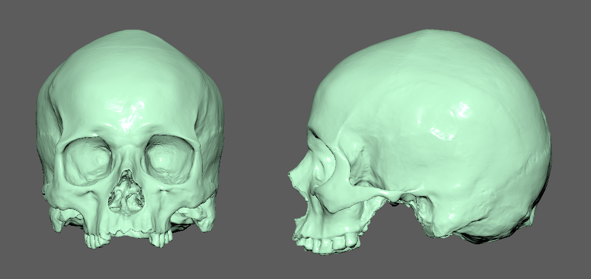
You can see the shape on the bottom of the skull is fairly flat vs. its round top, which I prefer since a good design philosophy is curve against straight. So embedding this idea from the beginning feels like an intentional choice rather than augmenting a shape to be more utilitarian. Another obvious problem with the Loomis method is the lack of tapering. Most organic objects taper or rarely retain the same thickness all throughout their length.
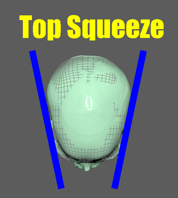
The head naturally tapers. Of course, this will change with more obese people, but the design philosophy remains the same principle. Tapered shapes are more pleasing to look at. The taper also exists when looking at the head from the top orthographic view.
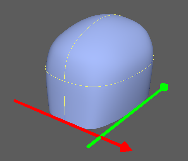
Now, drawing a skull for an establishing shape is contradicting my earlier complaint about the Loomis method, so in order to simplify, we will use a pretty simple shape that I think is more useful. A bell.
I think this shape is pretty simple to draw, and the added benefit is the bottom of the shape is planar inherently. When the shape’s center line is established, it can easily be bisected in half to immediately find the brow line. The bottom of this shape is the cheekbone/bottom of nose line. So with very minimal effort, we have important landmarks and a much more pleasing shape.
Proportions
With any drawing system or philosophy, proportions are necessary to establish.
“Proper proportions lie not in pages of statistics nor in the dogma of scientists, but in the mind of the individual artist. Proportions are entirely his responsibility, his decision” – Robert Beverly Hale
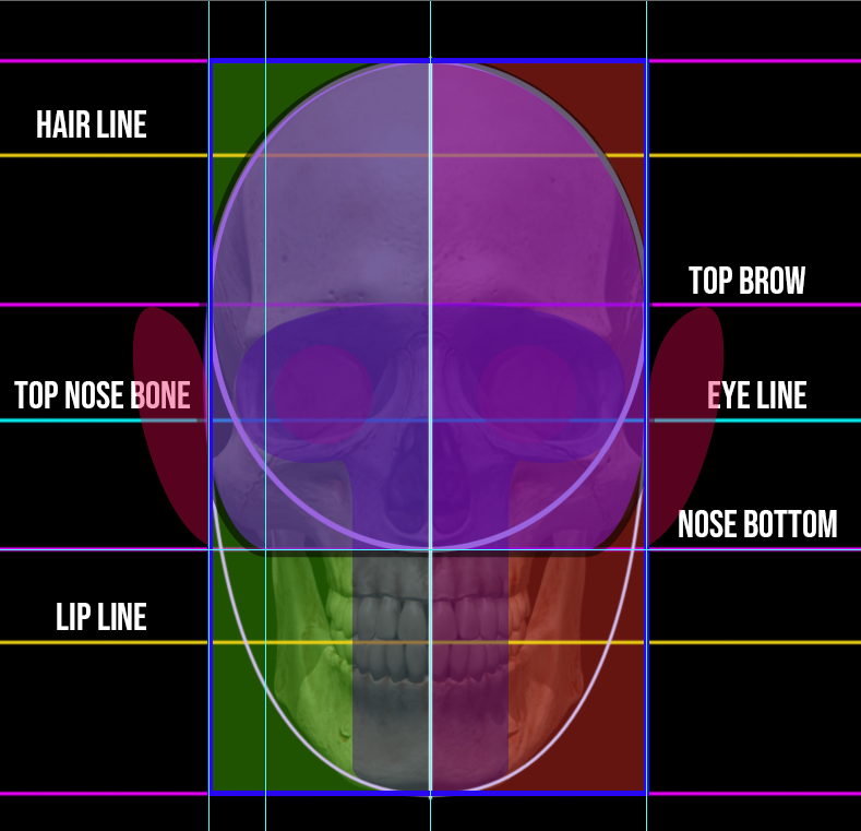
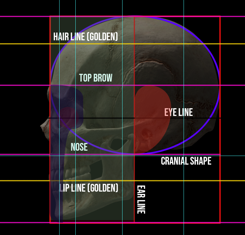
These are my own proportions. I wanted them to be as basic and as simple as humanly possible. You can see here these are my early ideas on how I came to this conclusion. Working backwards with all these measurements, then I found the core shape within. You may notice some key measurements here.
- The eye line is ½ the length of the head, usually it can vary slightly.
- From top of head to brow, brow to nose bottom, and nose bottom to chin are equal lengths/thirds.
- From chin to bottom nose, the top of the teeth/lip line will be a golden ratio.
- Brow to top of the head, the hairline will be a golden ratio.
- The ear exists from the brow line to bottom nose, the middle third segment.
- The jaw/ear line exists when the head is cut in half from the side/profile view.
Notice we aren’t including the nose and muzzle of the face jutting forward and past the head. We’re keeping it fairly flat since this is part of the morphology of people and will change quite a lot. Just know I measure from the cheekbone being the most front-facing plane to keep it more consistent.
The T Shape
You may notice something I included in my proportions. The T shape. This isn’t necessarily my own invention. I’ve seen some others use it, but in my opinion, it’s the most dynamic shape that quickly establishes where major features of the face exist at. I’ve seen other artists use a triangle, circle, or other marks to show where the boundary of the features will go, but I’ve never liked those shapes since they’re too ambiguous for me to find useful.
Conclusion
This post is a bit long-winded, but I’m happy to write and share this information. I learn a lot by doing this, and exploration is one of the true real joys of art making. Cheers!